hibu had an e-commerce platform with lots of legacy code and a design that wasn't ready for mobile devices. My team rebuilt the UI from scratch, then devised a plan to go responsive and improve the experience for mobile and tablet users.
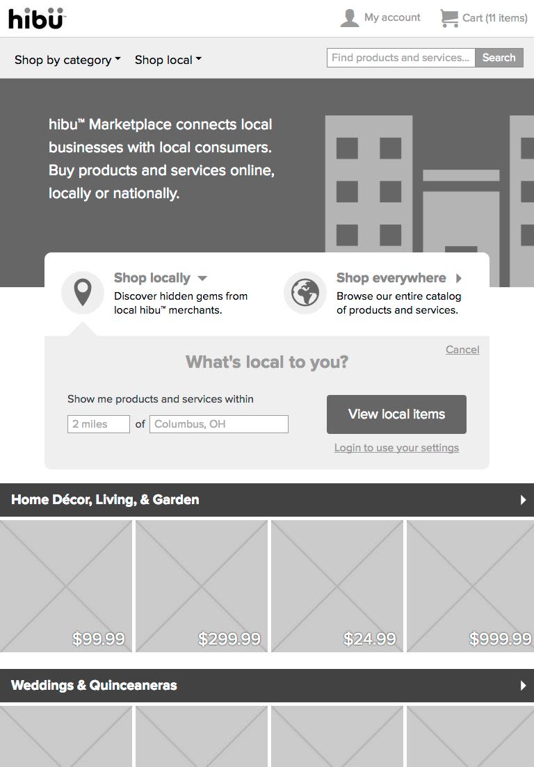
hibu acquired Znode, an e-commerce startup, in order to use their .NET e-commerce platform as the foundation for a series of new products. One such product was the hibu Marketplace, an international online "mall" with a local focus that would allow small merchants to create online storefronts and sell their goods and services to both local and national audiences. After a hurried beta launch, the product owners wanted to take the Marketplace to the next level, at which point I was brought on board to oversee UX design and UI development.
Laying the Foundation
While the core Znode product was a capable e-commerce platform, it was weighed down by years of legacy code that were then passed on to the Marketplace. In addition, a gap in UX expertise during its rushed development resulted in a shopping experience that wasn't up to current standards. The mobile version of the site was on a completely different platform (Java) with its own development team in another geographic location. All the technical leads agreed this was a less than ideal foundation upon which to build a flagship product.
After many strategy sessions and architectural debates, the .NET technical leads decided to rebuild the Webforms-based back end using a proper MVC framework, and I took this opportunity to completely rebuild the front end framework in order to prepare it for an eventual responsive redesign. I also wanted a front end that was accessible to all users and didn't have essential functions that were dependent on JavaScript.
Much like I'd done for Abercrombie & Fitch a few years before, I led the front end development team through a complete architectural redesign of the Marketplace front end framework. We rewrote most of the HTML, replacing scores of unnecessary nested containers with clean, semantic markup labeled with sensible IDs and classes. We threw out the existing CSS and replaced it with Sass, making use of variables and writing a library of reusable mixins. We removed the front end's dependency on built-in .NET JavaScript functions and implemented a logical JavaScript framework based on the module pattern and a select few JavaScript libraries. We minimized the UI's dependency on images by replacing all icons and image-based buttons with @font-face glyphs and CSS-based button styles; any design-related images that remained were incorporated into a single CSS sprite.
By the time we wrapped up the second release, the Marketplace had a modern, forward-thinking front end code base with concatenated and minified CSS and JavaScript libraries, minimal dependence on images, far fewer HTTP requests, and accessible markup that was SEO friendly. The .NET MVC effort was equally successful in terms of performance improvements and code that was easier to maintain. The hibu Marketplace was leaner, faster, and better than it was when we started. While proud of our technical accomplishments, we knew we still had a lot of work to do.
Selling Responsive Design
Before we could begin a responsive redesign, I had to sell the idea to senior management, so I spent a few days designing and building a semi-functional home page prototype to demonstrate the possibilities of responsive design. Incorporating requests from our merchandizers, I brought product imagery to the forefront and gave them space for promotional content that was lacking in the current design. Knowing that the concept would be demonstrated to business users on phones and tablets and given the limited amount of time I had to put it together, I focused my testing on iOS and Android phones and tablets.
hibu Marketplace responsive design proof of concept (HTML)
The concept was successful at demonstrating how the same content and functionality could be made to work across many different devices, and I received an enthusiastic approval to proceed with the Marketplace responsive UX design work.
Strategy & Process
We had minimal strategic input from the business, but we were able to establish the following goals:
We would take a mobile first approach and provide all devices access to the same content, adding appropriate enhancements and fallbacks based on device capability.
The focus on local products and services should continue to be a key strategy.
Beautiful product imagery should dominate the design and provide most of the visual interest.
At the request of our merchandisers, the layout should accommodate increased merchandising content, particularly on category pages.
I conducted a series of planning meetings with my team to identify our goals and put together a basic project plan. We started with a complete site audit, building inventories of content, functionality, and interface elements. Using that as a starting point and basing our decisions on the goals above, we decided what functionality was essential and should be maintained, what functionality could go, and what was missing. I directed one UX designer to create style tiles based on the interface inventory so that everyone could work independently, but still maintain a consistent look and feel. I assigned a UX designer to each page on the site, and it was each designer's responsibility to come up with the initial concept and wireframes under my guidance, which we would then flesh out as a team in our daily review sessions.
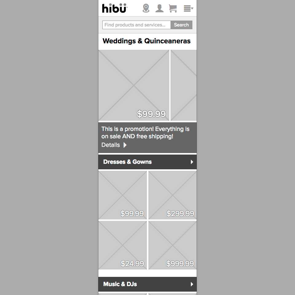
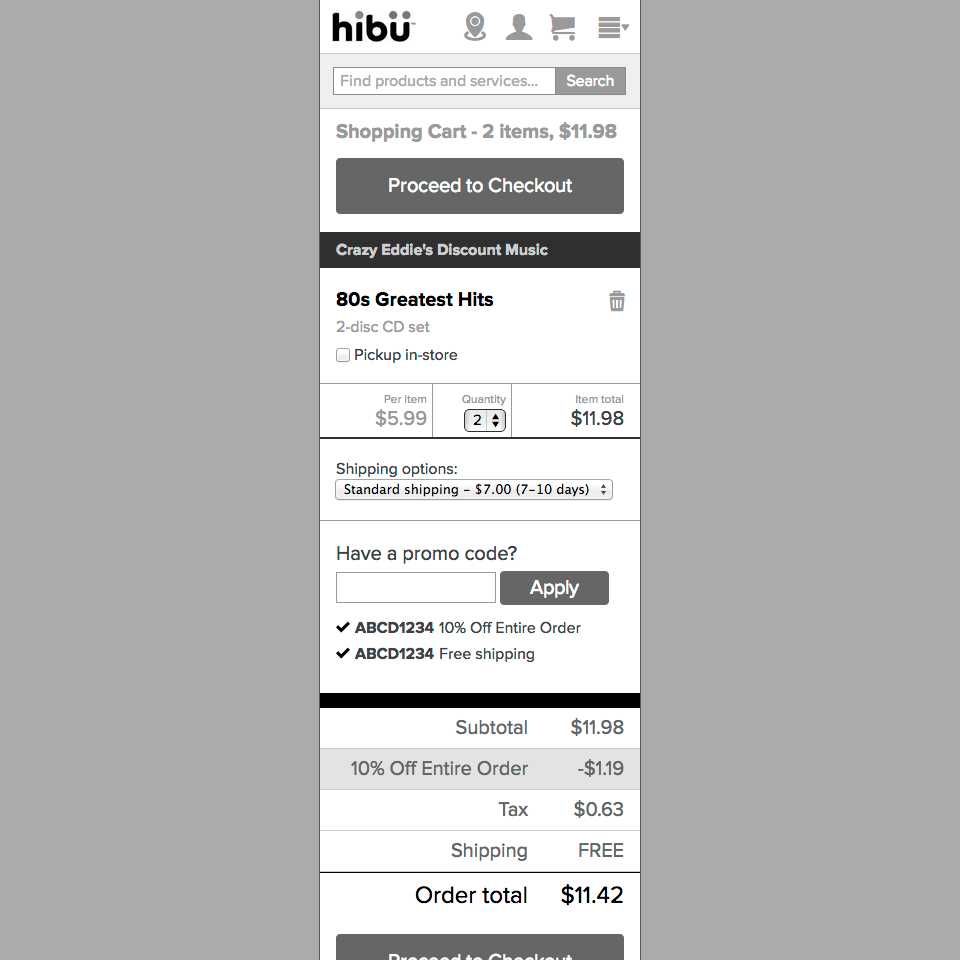
We spent the next round of meetings discussing the challenges of UX design on a responsive redesign project with a tight deadline. What should be our target viewport sizes and where should we set our breakpoints? Should we adopt a mobile first approach? Should we use an existing framework or roll our own? What would be our deliverables? In all our discussions, one thing was clear: after coming to a general concensus during our whiteboard sessions, we should go directly to low-fidelity prototyping in the browser. Draw it on the whiteboard, take a picture with your phone, then get back to your desk and start coding. It would be a Lean UX process based on discussing, sketching, prototyping, testing, and iterating, and the final deliverable would be low-fidelity, fully responsive HTML prototypes of the entire site.
hibu Marketplace home page whiteboard sketches
HTML wireframes have many advantages over flat wireframes. Our wireframes would be interactive and responsive, so they could be viewed on any device in a browser and behave like the final product would; just toss them onto a server and give stakeholders the URL. Many interaction design decisions made during the UX process wouldn't need to be written down in technical documentation because they would be self-evident. For example, if clicking on an anchor should cause a form to slide down and be fully visible in 250 milliseconds, it's right there in the wireframe and its source code. The risk of details getting lost in translation from wireframe to final code is greatly reduced compared to a traditional flat wireframe. Another benefit would be easy versioning using a git repository and local branching, just like production code. And large sections of that very same code would be reusable in the production version as well.
hibu Marketplace responsive design HTML prototype
Lots of teams are struggling through the complexities of UX in a responsive design, and using a Lean UX process, my team delivered on the goal of producing functional wireframes that effectively convey the requirements of responsive e-commerce. This project convinced me that responsive design is the future, and that the advantages of a mobile first approach far outweigh the IA/UX difficulties that come up during the design process.
While the challenges of UX design on a responsive project are significant, we proved they're not insurmountable.
hibu Marketplace HTML prototype
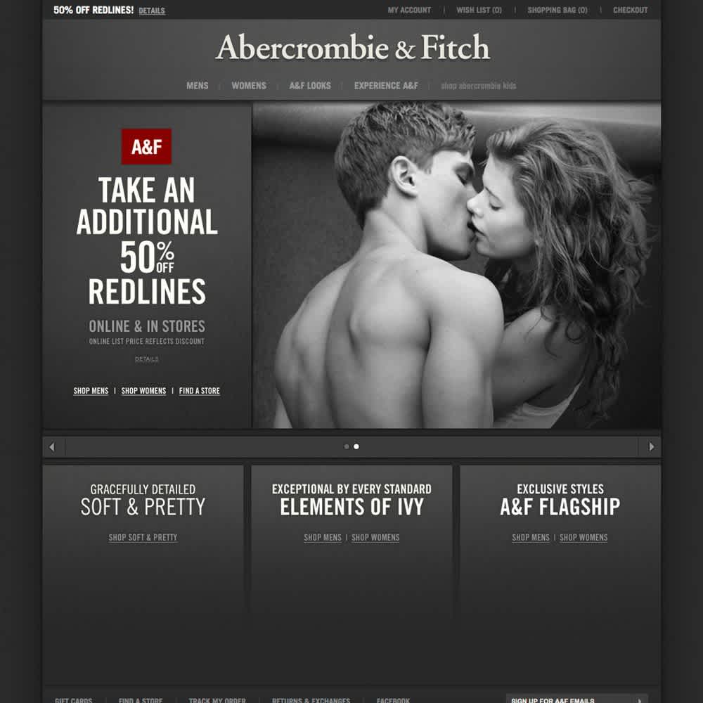
Abercrombie & Fitch E-commerce Front End
Abercrombie & Fitch had four distinct brands running on four distinct code bases, leading to lots of duplicate development effort. My team engineered a front end framework so we'd spend less time chasing problems and more time building solutions.