Linode redesigned their admin panel for the first time in over a decade, but its reception by longtime customers was mixed at best. We performed extensive research and addressed years of feedback, completely rethinking the product in the process.
Linode is an innovative cloud hosting provider that made their name as an affordable, developer-focused VPS service. Their browser-based administration panel, known as Linode Manager, was designed in-house by the company’s engineers to be a fast, no-frills interface for customers to manage their virtual machines, domains, and other cloud assets.
As the cloud hosting industry grew, competitors joined the market with similar services. Linode Manager went without significant changes for over a decade aside from new functionality to accommodate a growing product line, allowing their competitors to surpass them with a far superior user experience. Not wanting to be left behind, Linode partnered with a creative agency to redesign Linode Manager to suit modern expectations.
The new administration interface, known as Cloud Manager, had a clean aesthetic that was more in line with contemporary design sensibilities: flat, minimal, and greatly simplified. Increased white space gave the layout significantly more breathing room and certain advanced features were pushed deeper into the interface so as not to discourage less experienced users.
The redesign was divisive, however, catering primarily to customers with larger fleets and lacking core features that were essential to many customers’ workflows—so much so that Cloud Manager was kept in open beta for years as Linode Manager continued to be the default interface for many existing customers.
When I joined the company, I was determined to make Cloud Manager a great experience for all customers and finally sunset the old Linode Manager.
User Interviews
The primary feedback gathering mechanisms for Cloud Manager when I joined Linode were support tickets and a feedback e-mail address displayed in the Cloud Manager UI. The Customer Success team created a post-cancellation survey and acted as a channel for larger customers to voice their grievances. Marketing launched a beta program called Greenlight to preview new products prior to release and created a brief survey to gather feedback. There was little active outreach for smaller customers—who made up the bulk of Linode’s customer base—and no moderated user testing for new products and features prior to launch.
I partnered with Customer Success to identify users who represented a broad spectrum of use cases and interviewed those users to learn what they thought about Cloud Manager, how it compared to the old Linode Manager, and what they’d like to see in upcoming iterations.
As it turned out, many users found Cloud Manager a downgrade from the old Linode Manager for various reasons. They appreciated the new design’s clean aesthetic, but bemoaned the reduced efficiency; adding copious amounts of white space led to a significant reduction in information density, and burying more complex tasks deeper in the interface catered to novices rather than experienced users—a big departure from the market segment that brought Linode its initial success.
The redesign had also focused on large customers with many assets to manage, again setting aside Linode’s small developer-focused roots. With roughly half of Linode’s customers having only a single virtual machine (known as “Linodes”), changes meant to improve the experience for their largest customers were often to the detriment of their smaller customers.
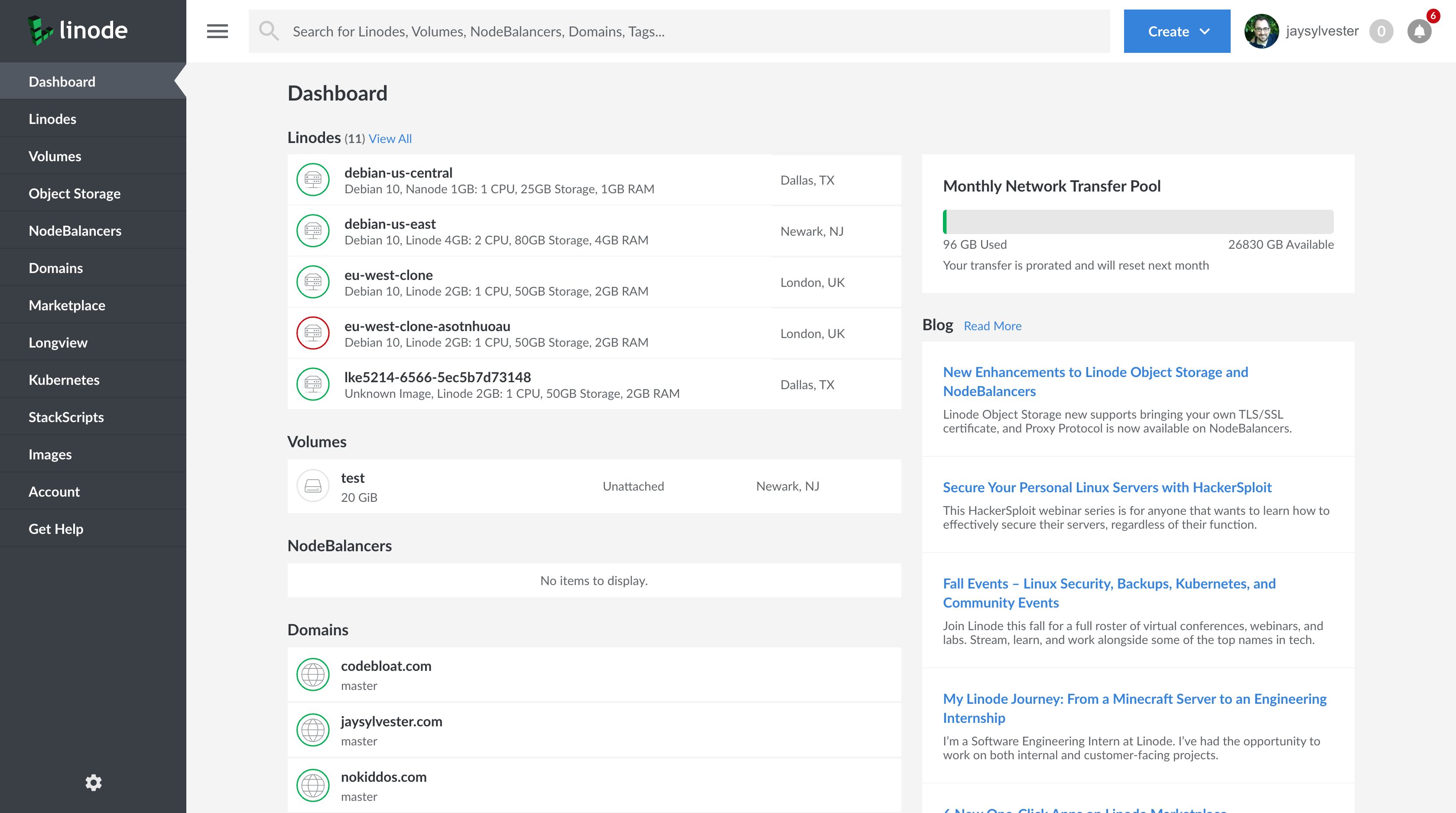
The Cloud Manager dashboard was a good example of prioritizing larger customers. Providing a summary of the user’s assets, it was clearly designed to accommodate many items, but offered little value to customers with a single node. It also dedicated too much space to marketing and company blog content that most users found useless—even annoying—within the context of an administration panel.
Before: The Cloud Manager dashboard didn’t work well regardless of how many Linodes the customer had and wasted space on irrelevant marketing content.
In talking with Linode employees, I came to find out the agency didn’t design the dashboard; the engineers put it together at the last minute without any design direction.
The notification system confused users. Traditional notifications rely upon a single icon (usually a bell), but Cloud Manager split its notifications across two icons. Most users I asked couldn’t tell me which notification would show up under which icon and all thought it was an odd approach.
Before: Dual notification icons in the header were confusing to most users.
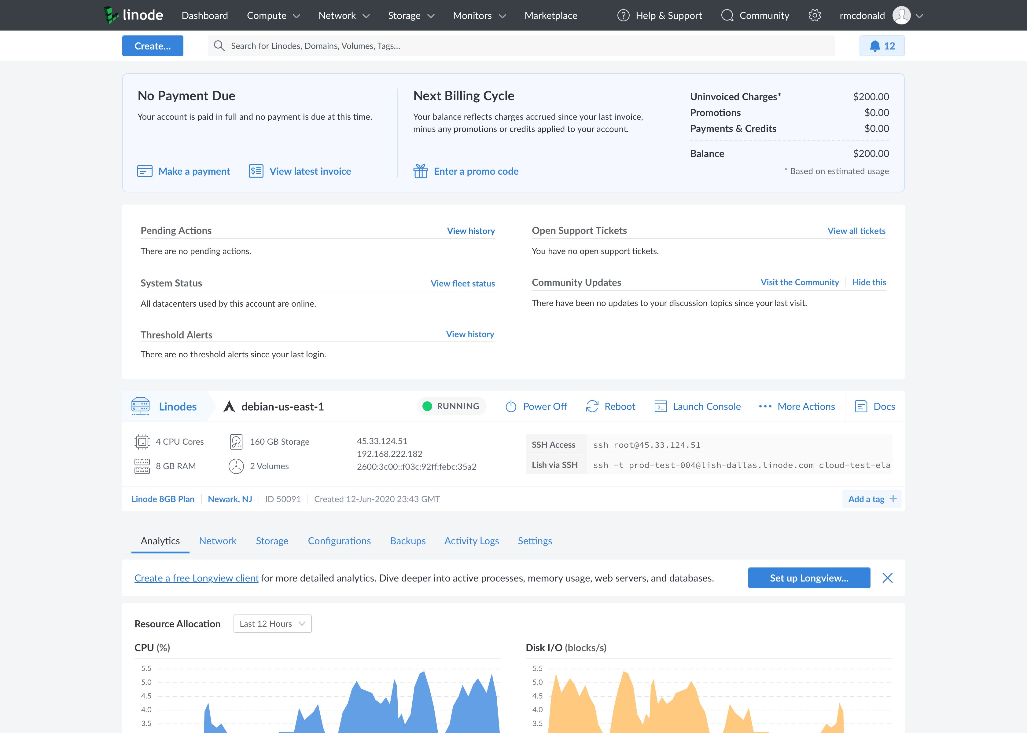
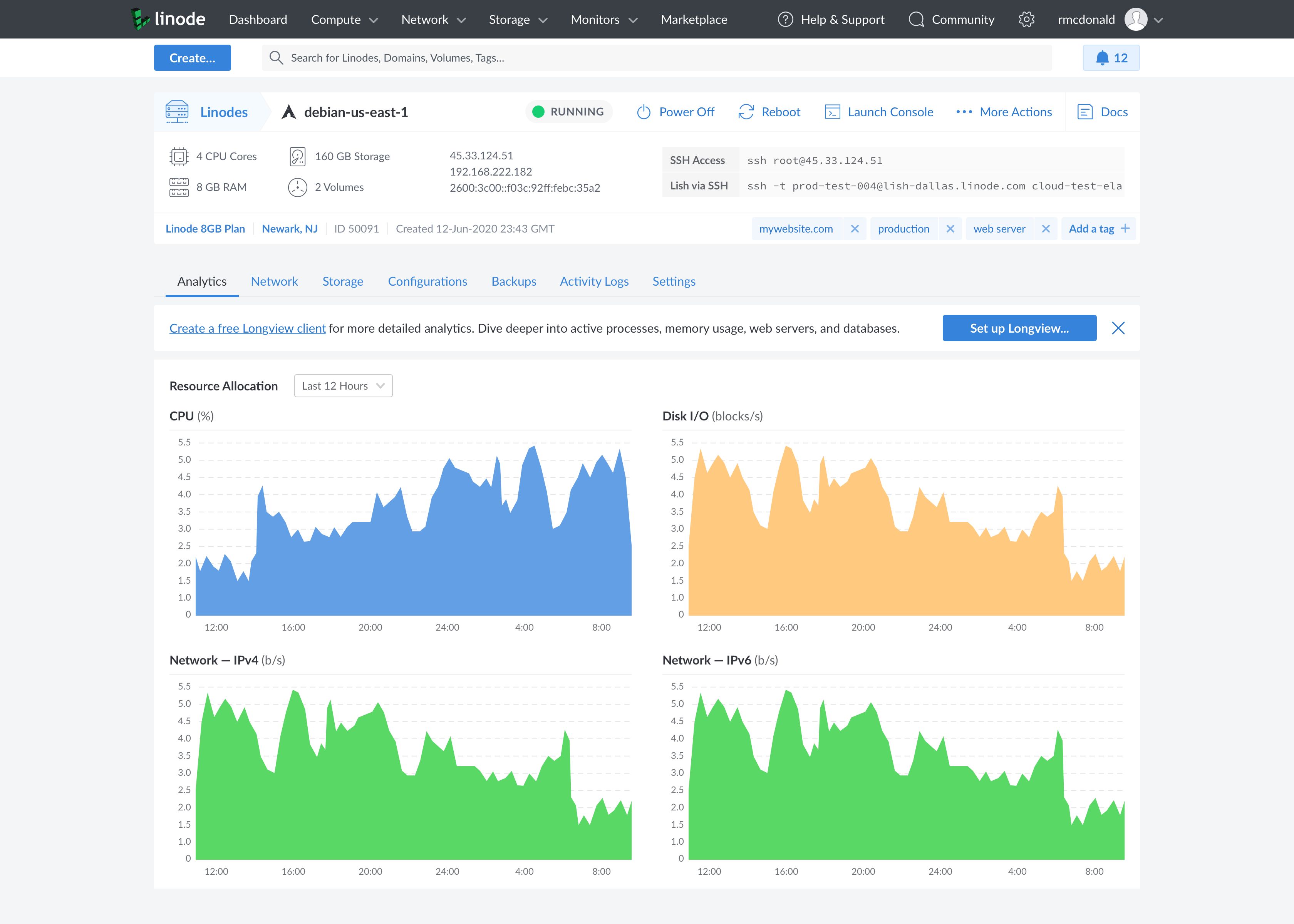
Customers with a single Linode considered the Linode detail view to be their most valuable asset since it contained the bulk of the info they expected to see at a glance. With none of this info on the Cloud Manager dashboard, these users saw mostly irrelevant content immediately after logging in, and their first action was almost always to click on their node to get to the detail view. The detail view wasn’t without its problems, however.
Before: The Cloud Manager detail view made poor use of screen real estate and scattered key actions across multiple tabs and menus.
Important SSH connection information—essential for first-time users—was buried in the Networking tab. Additional details were relegated to a right column that wasted valuable real estate. The tab navigation was an odd mix of data and actions—some rarely used—while the commonly-used Power On/Power Off action was located in the top right with an unassuming design that new users easily missed.
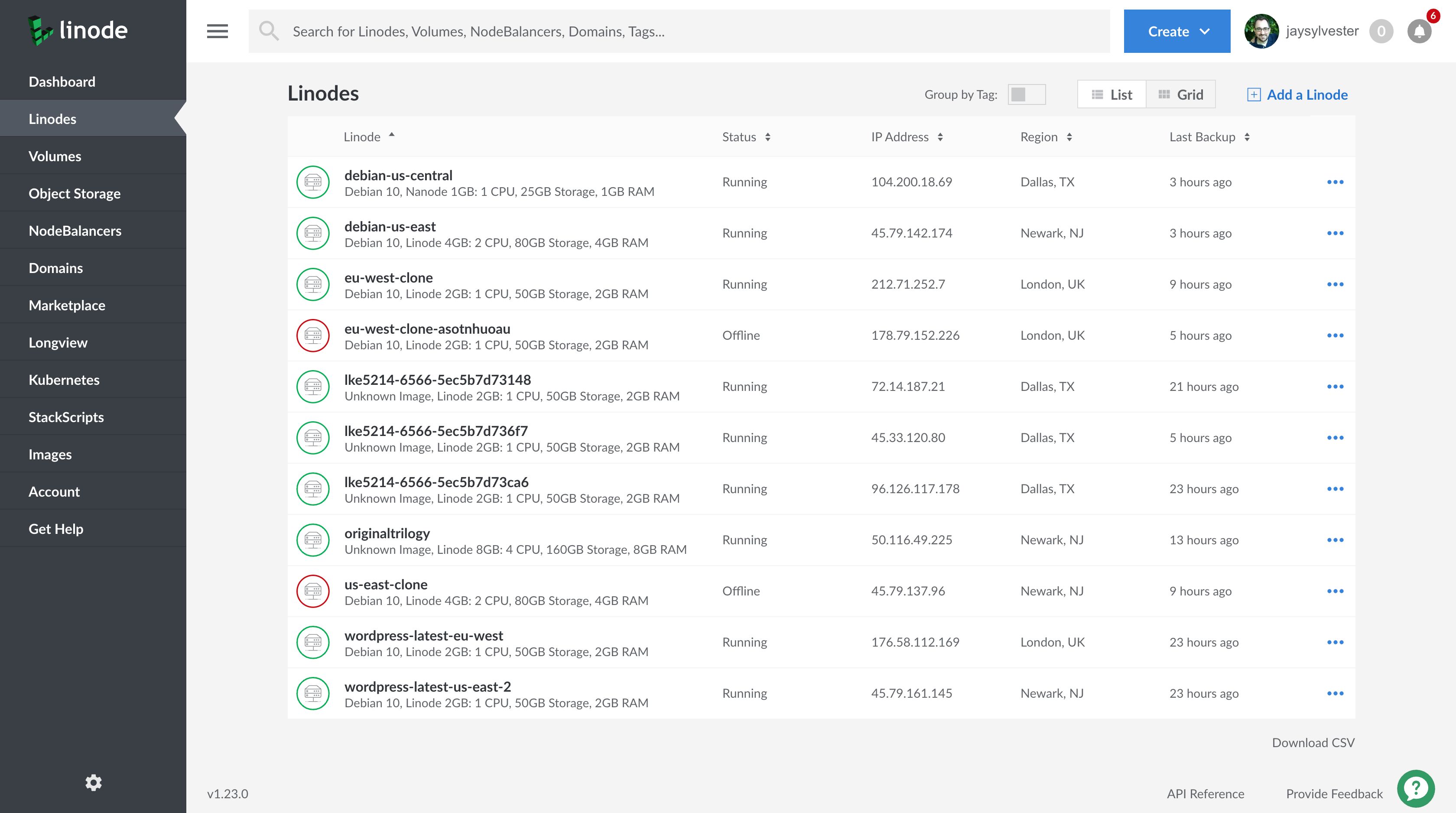
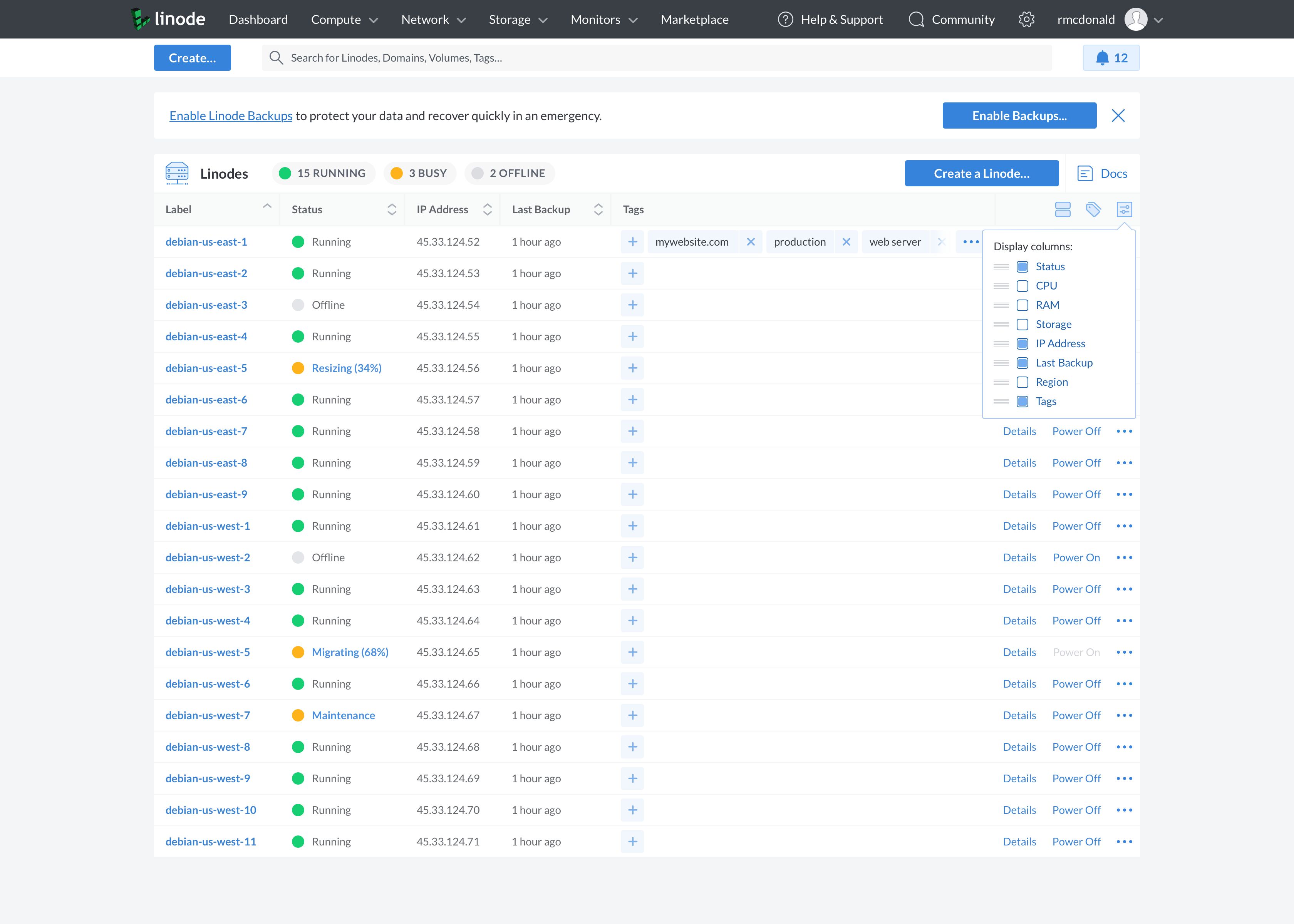
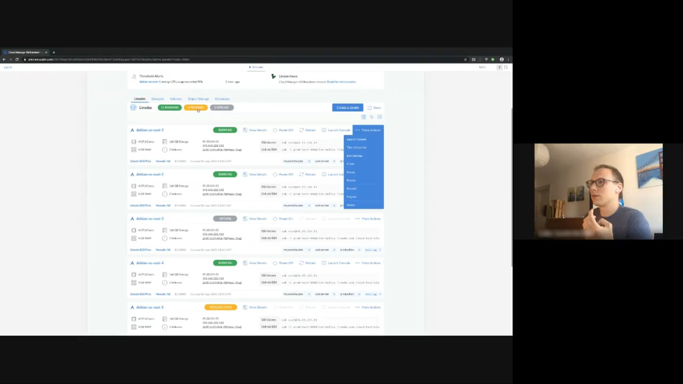
The Linodes list view was another example of a screen designed to accommodate a larger number of Linodes while being much less useful for customers with a single Linode or a small fleet.
Before: The Cloud Manager list view provided low information density and had accessibility issues for colorblind users.
The list view was good for getting quick status of a large fleet at a glance, but not much else. And if a customer did have a large fleet, the content of each table row was somewhat tall, meaning that far fewer Linodes would appear on screen at the same time, forcing more scrolling. The list view also had accessibility issues because a node’s status—online, offline, etc.—was conveyed only via a colored ring around the node’s icon. Colorblind customers called this out specifically. Overall contrast was low like many designs at the time, with gray text on a white background.
I drew upon these user interviews, the backlog of support tickets and feedback e-mails, and my own experience using the product to design and prototype a Cloud Manager experience that would serve customers of all sizes.
UX Design
I set the following design goals:
Redesign the dashboard, list view, and detail view to provide useful information regardless of the customer’s fleet size.
Reorganize the information architecture, paying particular attention to consistency in menus/actions across different screens and information hierarchy within each screen.
Improve clarity of and access to status and notifications.
Increase information density for easier scanning and decreased scrolling; it’s a complex administration tool, not a marketing site.
Address accessibility issues related to the visual design.
I knew based on my research I’d be proposing major changes to Cloud Manager, and while I’d normally take the time to do some rough sketching followed by annotated wireframes, I had a fixed window within which the developers would be available to work on these updates. Since I planned to keep the existing visual theme (colors, fonts, etc.) and many existing elements would be reused with minor changes, I decided to go straight to high-fidelity mockups to speed up the process considerably.
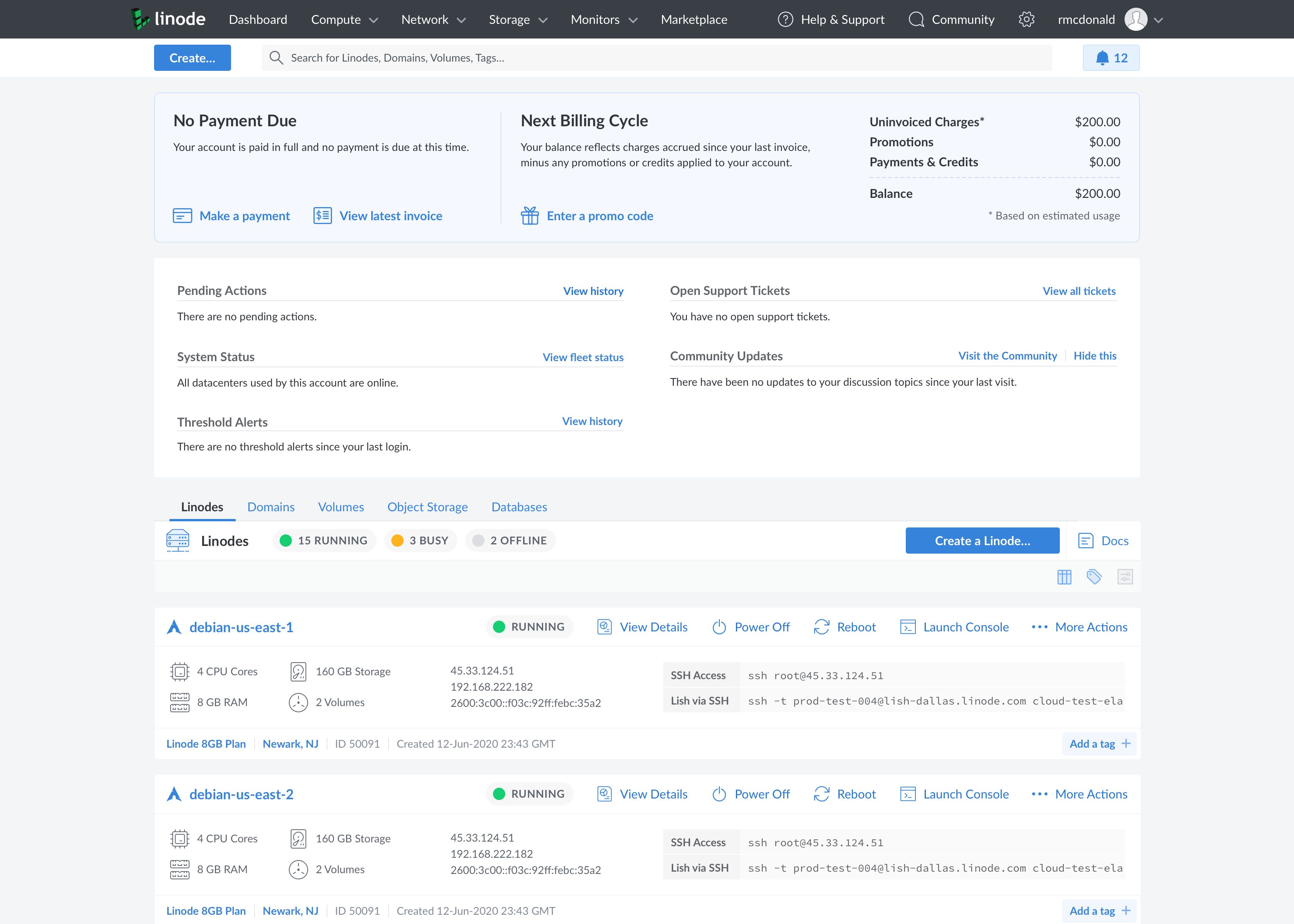
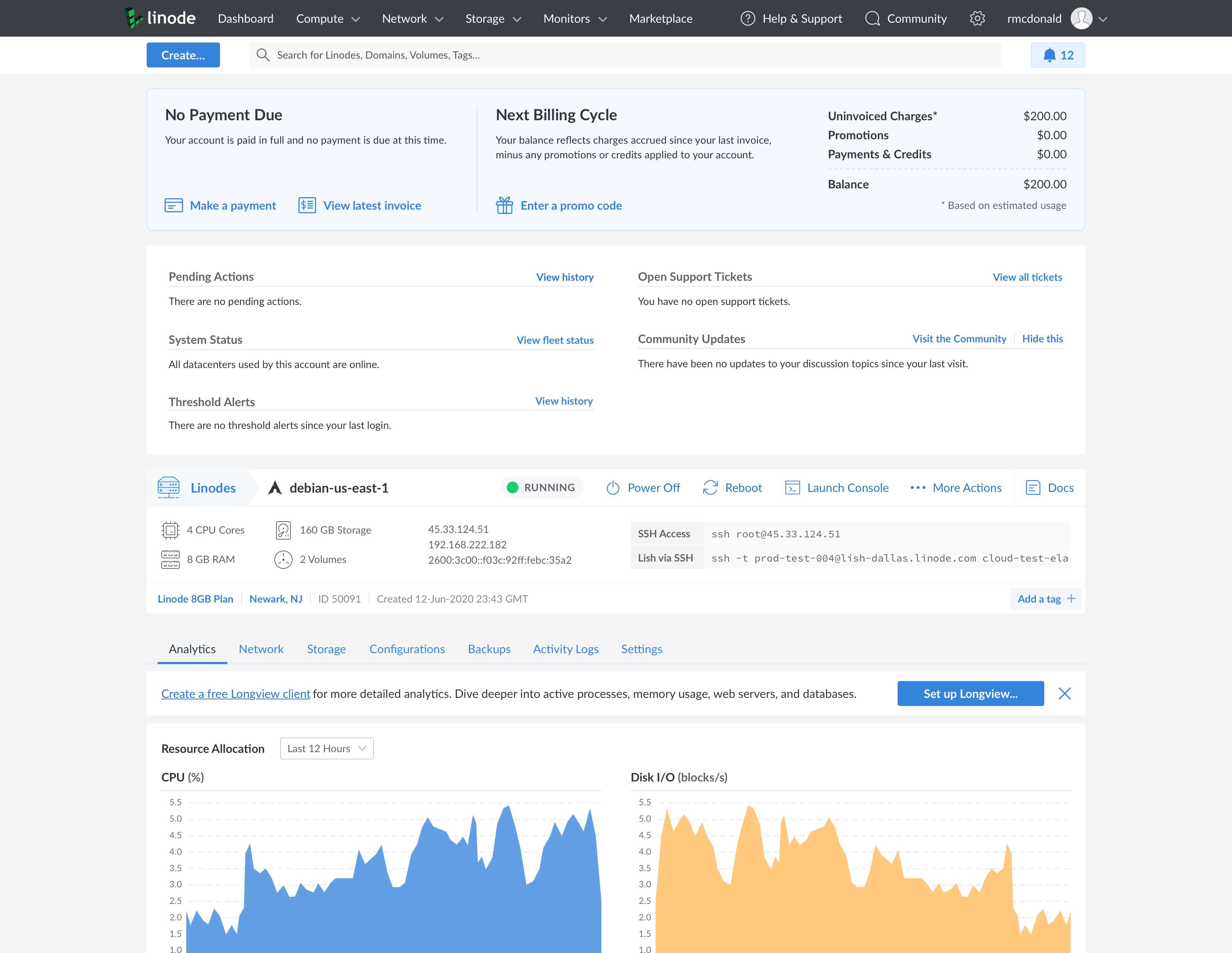
I started with the dashboard, which I completely redesigned from the ground up to work well regardless of how many Linodes the customer managed. I incorporated content that most users would find useful and customized fleet representation based on the user’s account.
After: The new Cloud Manager dashboard contains billing information and relevant systems status, and tailors its fleet overview to the user’s fleet size.
All users see their account balance at the top of the new dashboard, followed by a thorough summary of account status, including network availability, open support tickets, and performance alerts for their fleet.
The customer’s fleet size determines the remaining content. If they have a single Linode, they see a detailed summary with important information like specifications and connection info, followed by detailed analytics with additional tabs for different data and controls. If they have a larger fleet, a compact list view provides relevant data allowing them to see the status of their fleet at a glance.
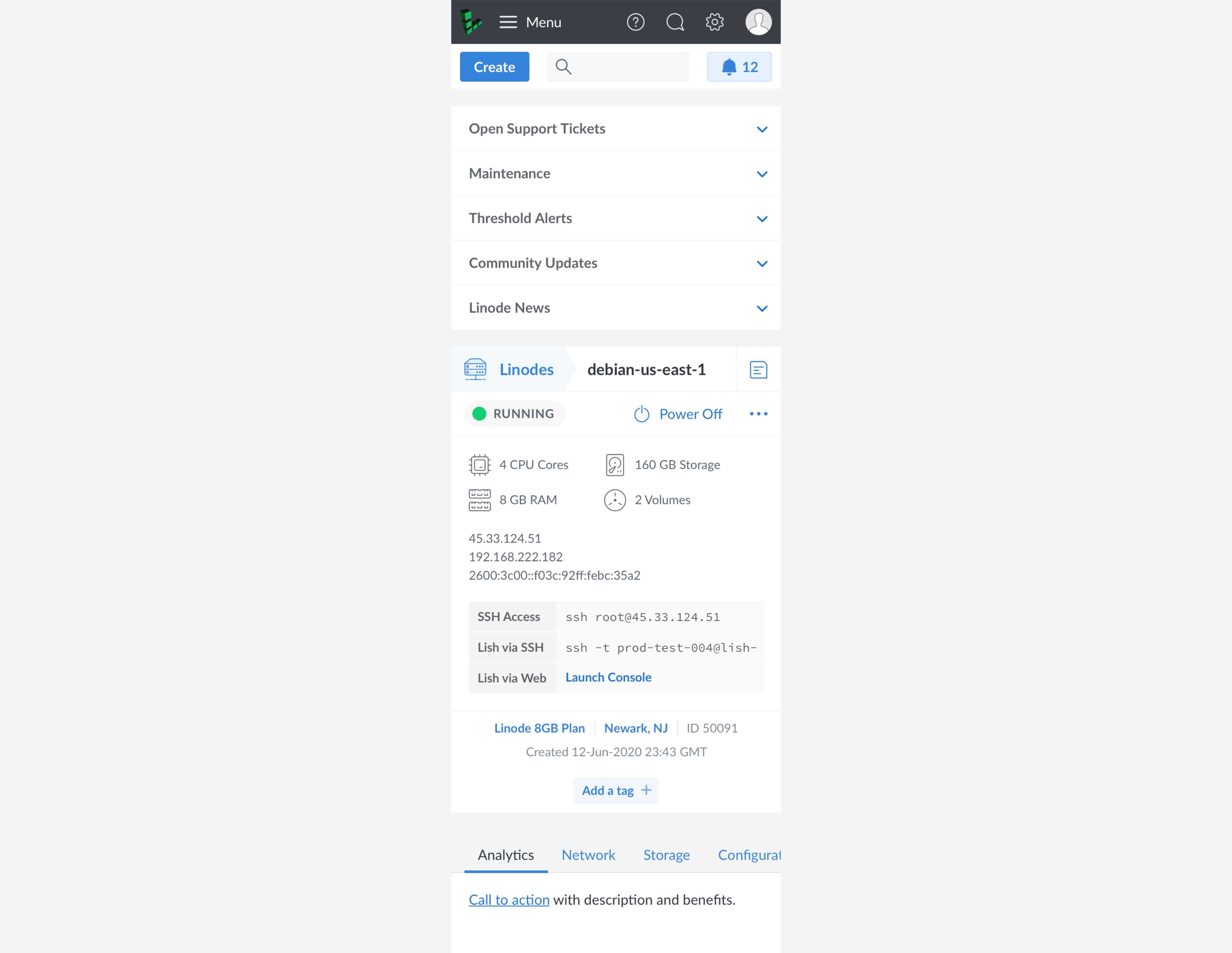
The list view is configurable, so customers choose either a compact view to suit a large fleet or detailed summaries that are better suited to managing a smaller number of Linodes.
After: The new Cloud Manager dashboard list view lets users swap between a compact view for larger fleets and an expanded summary view for additional detail.
This same functionality is present on the dedicated list view, accessible from the primary navigation under “Linodes”. In addition, I fixed the status accessibility issue by creating a dedicated Status column that shows node status using both color and text, with the added benefit of making it a sortable column. I also added status filters at the top of the table using both colors and labels so users could identify how many nodes are offline at a glance.
Each node in the list view has a reorganized action menu; this same menu is also on each node’s detail view, providing consistent menus and actions across views. The list view is also configurable, so customers can select the sortable data points most useful to them.
After: The new Cloud Manager list view has a comprehensive action menu for each list item and allows users to customize the table data points.
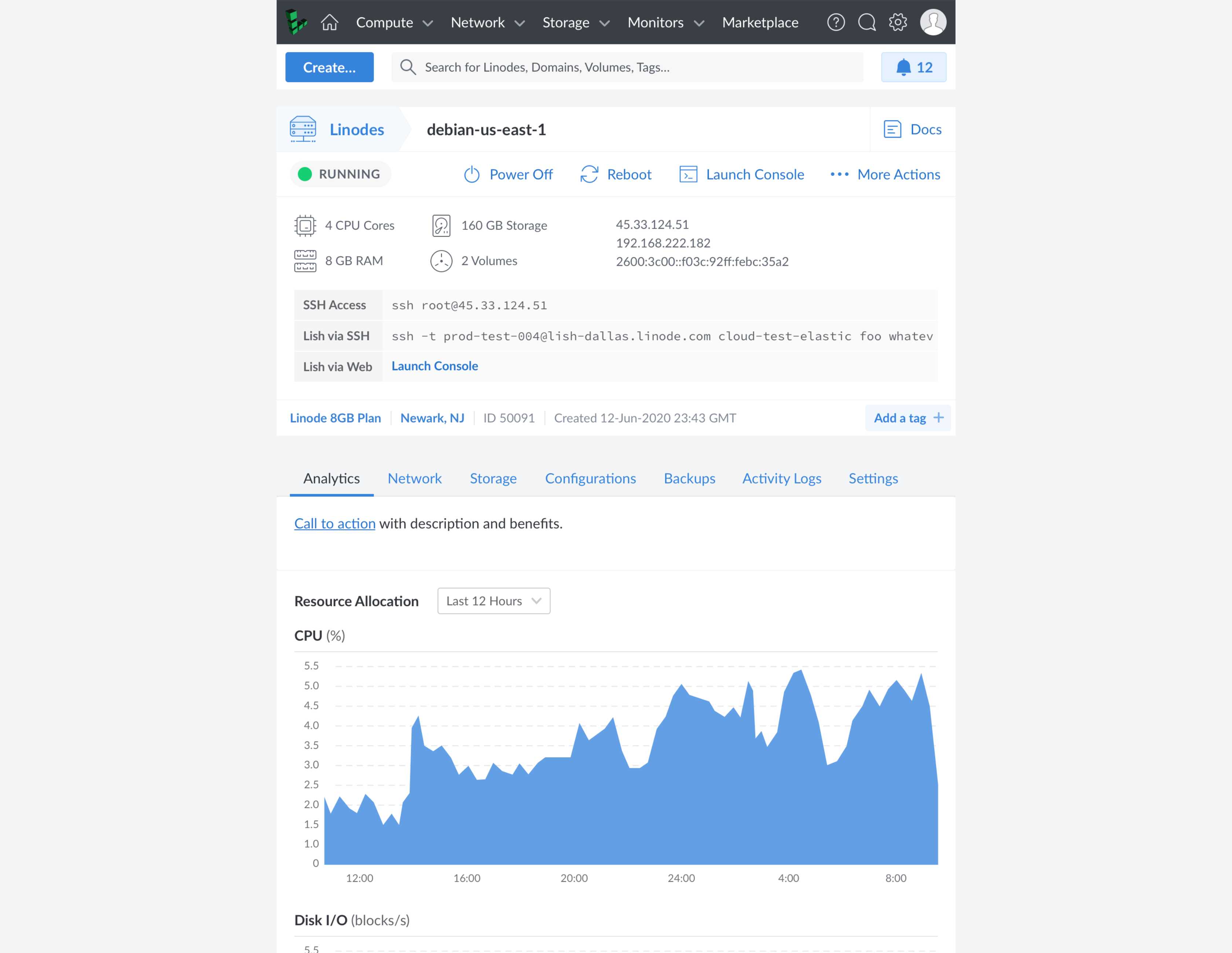
The redesigned Linode detail view places connection information in the top summary—crucial to new users who are connecting to their node for the first time—along with a prominent new action menu that is consistent with the list view actions and calls attention to functionality that was obscured or jumbled with the tabs in the previous design.
After: The new Cloud Manager detail view gives high priority to critical information and shares a new action menu consistent with the menu on the list view.
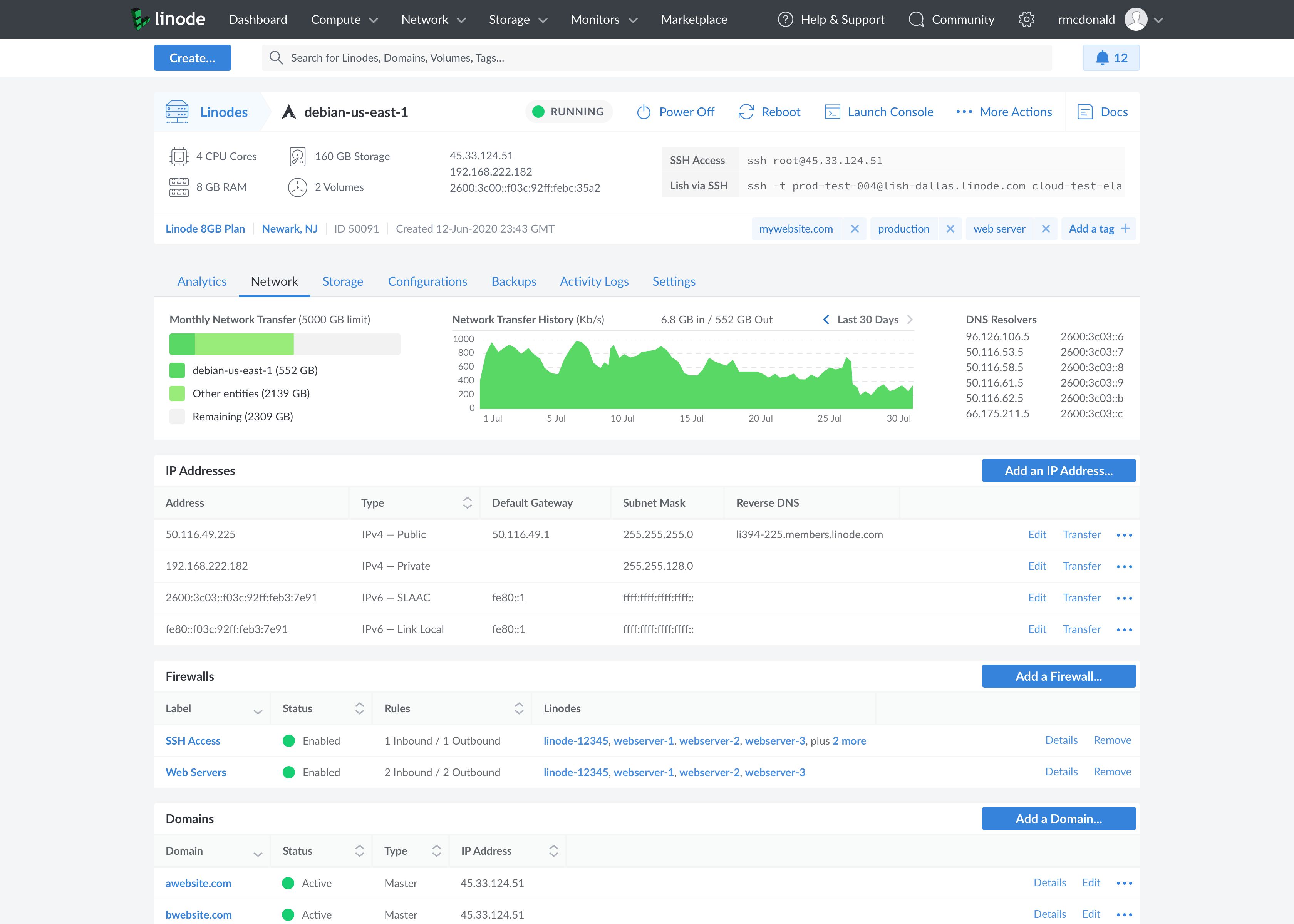
Analytics remain at the forefront with a reorganized tab structure focused on presenting data rather than performing actions, which have been relocated to the new action menu. Each tab provides context for that particular node within the customer’s fleet and related assets, including network connections, firewalls shared with other nodes, and storage volumes.
After: The redesigned network and storage tabs reflect the node’s relationship to other assets in the user’s fleet, such as domains, firewalls, and volumes.
Through my interviews, I learned many users leave Cloud Manager open throughout the day to stay abreast of updates, so the last significant upgrade I designed was a new notification center containing more details and improved visual queues. I also provided the option to enable desktop notifications so users wouldn’t need to keep Cloud Manager open and active at all times.
After: The new Cloud Manager notification center provides comprehensive account and systems status accessible anywhere in the admin panel.
Many of Linode’s engineers actively use Cloud Manager for their own Linodes, so circulating the mockups around the company enabled me to gather meaningful feedback from real users and ensure I didn’t miss important features.
Usability Testing
I created functional prototypes in UXPin in order to conduct usability testing. I chose UXPin because it allowed me to import my mockups from Sketch, and rather than simple page flips and transitions provided by InVision and similar tools, UXPin allowed me to simulate interactions that were much closer to a real web app, including hover states, tooltips, menus, and tabs.
Under normal circumstances, I would’ve written detailed test scripts to verify specific interactions, but since this project was geared toward improving the experience for existing users, I took a freeform approach and asked test participants—who were all customers I’d interviewed at the start of the project—to use the prototype as they would the real Cloud Manager during their normal workday, while also allowing them to explore the UI and try different things.
Usability testing with a functional prototype is an essential part of validating design decisions.
My biggest concerns surrounded interactions with the new primary navigation, Linode action menu, and detail view tabs, so I was happy to see that either on their own or when asked to perform a specific action, the test participants managed to navigate the new IA easily and succeed in their tasks every time.
I did make a few changes based on their feedback. For example, I thought having items in the notification center organized by type would be useful (similar to the status area on the dashboard) because some notifications are more urgent than others, but the majority of users preferred they be listed in chronological order with the newest at the top, so I made chronological sorting the default with categorical sorting as an option.
Open Beta
We released the new Cloud Manager design as part of the Greenlight beta program. I created a Google Forms survey with the help of the marketing team to solicit feedback from beta participants, and we also accepted feedback via the Greenlight Slack channel and direct e-mail at a dedicated beta e-mail address.
Feedback was overwhelmingly positive. Of course, with Linode’s customers being quite particular, they still had plenty of suggestions and ideas, but the overall tone was one of positivity and significant improvement over the previous design.
Linode Cloud Manager
Vidyo Remote Collaboration Solutions
Vidyo had a complex video conferencing suite that spanned many platforms, but the experience was inconsistent across devices. I defined crucial UX processes and led the design team in establishing a unified presentation across the entire product line.