Case Study: Fitly Online Store
Making it easy for busy families to plan and prepare healthy, delicious meals
Fitly built an e-commerce site that had some UX challenges stemming from its startup incubator roots and a complex pricing model. I was tasked with improving the user experience and rebuilding the responsive front end to reach MVP status.


Fitly was my first experience with a startup. When I came on board, the existing product was the result of a startup incubator, and it was about what you would expect considering its origins: good at demonstrating the concept—choose healthy, delicious recipes and have their ingredients delivered fresh to your door—but troubled in its execution. There were significant e-commerce usability problems including unclear pricing and a confusing checkout process, and while the bootstrapped front end architecture was responsive, it was buggy. We had a small team, big ideas, and not a lot of time before launch.
Design Challenges
We wanted to remain tightly focused and include only what we needed for an MVP, but there were still hard requirements that had to be met based on business needs and technical feasibility. Having worked on a number of e-commerce sites before, I knew much of the UX design would be straightforward, but there were a few requirements that made Fitly unique:
- Our service would only be available to select zip codes at launch, so users outside those zip codes shouldn't be allowed to place orders
- Paying customers needed easy access to the recipe preparation instructions in the kitchen, but we didn't have time or money to provide printed recipe cards with each order like our competitors
- Recipes would have a tiered pricing structure based on the quantity (number of servings) purchased, so the price would change based on the number of items in the user's shopping cart
Mobile First and Lean UX
Given the tight deadline, I decided that we'd produce wireframes for mobile only and then design in the browser from there, getting buy-in from the team as we went. I believed this approach would work well with my plan to follow a mobile first design process; mobile wireframes would demonstrate all functionality to the team, which would be enough to get their approval on functional concerns and give the back end developers what they needed to perform their work.

During the design process, the team met Monday, Wednesday, and Friday to review the wireframes as a group and provide feedback. We iterated quickly and dealt with unexpected challenges on the fly. Requirements frequently changed midstream, but with only mobile wireframes to maintain, I was able to keep up with these changes.
While a true Lean UX approach would probably call for even fewer formal wireframes, I still consider our approach fairly lean because I only produced wireframes for mobile devices and they were virtually unannotated. We had no written requirements whatsoever from the stakeholders, so I felt it was necessary to codify certain requirements and get sign-off from all parties. I also wanted to provide at least a minimum technical specification for the back end developers to reference while programming.

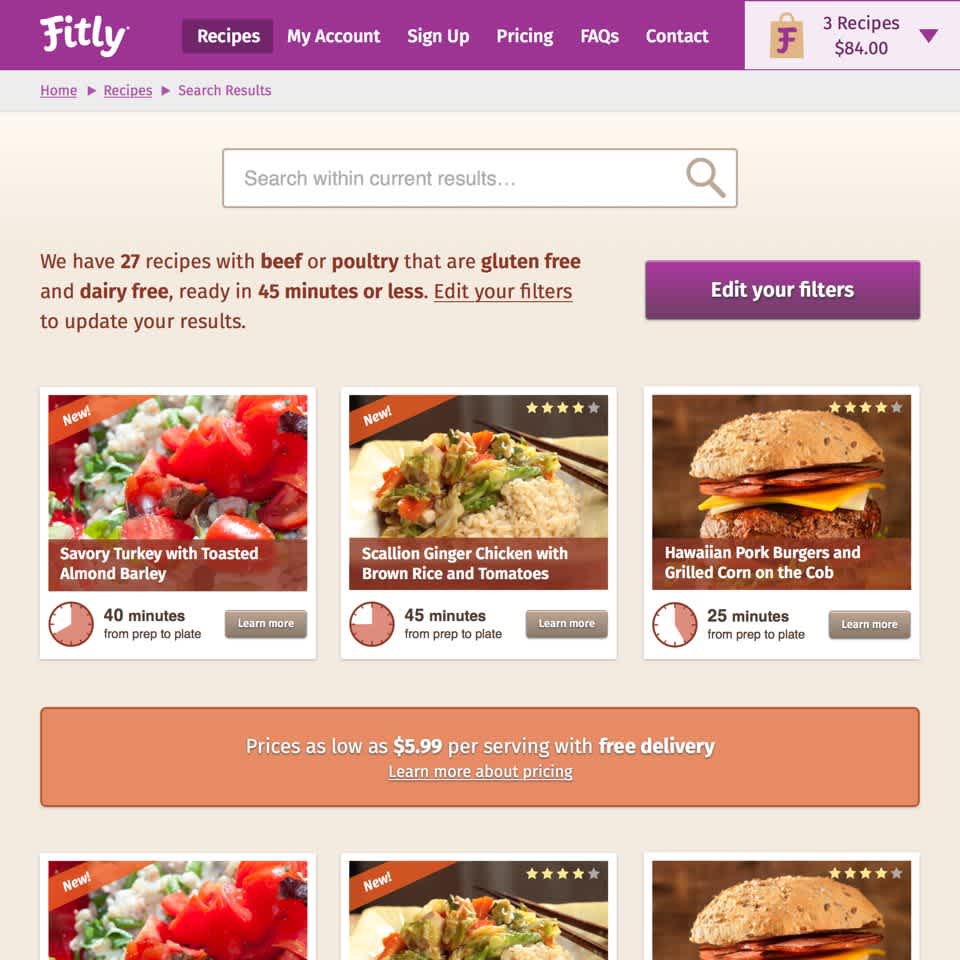
UX Challenge #1: Delivery Zones
With the Fitly service only available to select zip codes at launch, we had to make sure that users outside those delivery areas weren't able to place orders. During account creation, users had to provide their zip code, so users who were logged in didn't present a problem, but anonymous visitors did. The initial solutions requested by the stakeholders were to require an account to access recipes or block the public from accessing any recipes without first providing their zip code. This also aligned with the stakeholders' desire to protect the recipe content.
I recommended against requiring an account simply to view our product due to the friction that would add to the experience. I felt Fitly's value proposition lie not with the recipes, but with the easy meal planning and grocery delivery. I also knew we would miss out on SEO benefits if we prevented search engines from indexing our recipe content. However, I didn't want users outside our delivery area adding items to their cart and getting all the way to checkout only to turn them away once we checked their zip code.
I proposed we open our recipes to the public and simply add a zip code field above the "add to cart" button on the recipe detail page with a note explaining why we were asking for it. If the user's zip code were in our service area, we'd add the item to their cart and set a cookie so we'd know they were in a valid delivery area. The zip code field would be hidden for that user from then on, and we wouldn't ask them to create an account until they entered the checkout process. If we didn't deliver to their zip code, we'd forward them to our newsletter signup form to collect their e-mail address and notify them when Fitly became available.
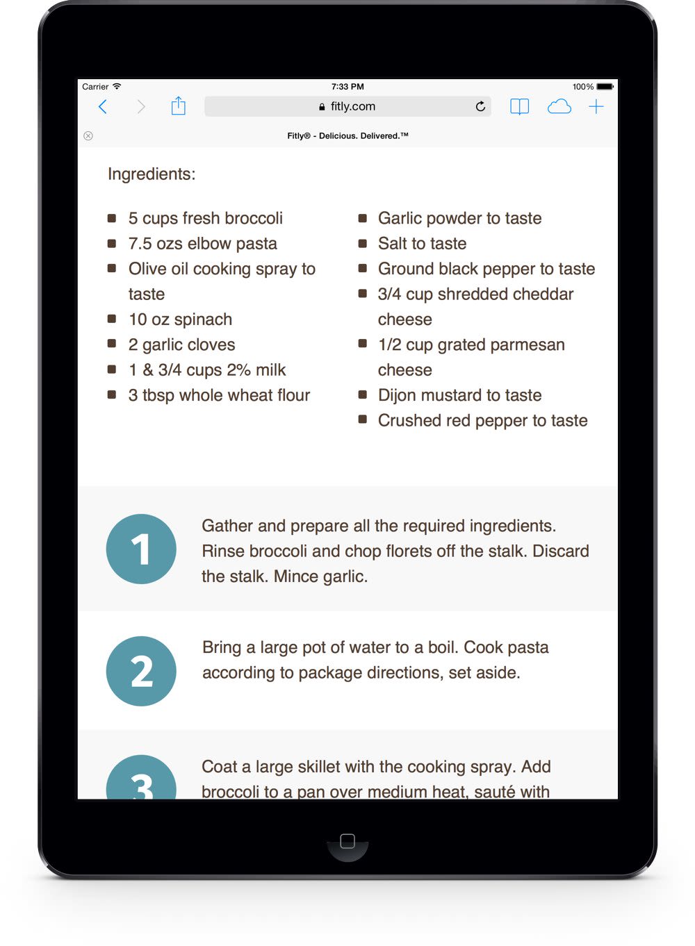
UX Challenge #2: Preparation Instructions
Fitly's competitors had been on the scene for significantly longer than we had, giving them more time to solve certain logistical problems and obtain significant funding. One of the nice aspects of their experience was the inclusion of printed recipe cards with each grocery delivery. When the customer received their groceries, they also received a printed set of cards with the ingredient list and preparation instructions. We had neither the time nor the funds to do the same for launch, so I had to come up with a solution to get us by.
During our user research, we discovered that people sometimes use a tablet or laptop in the kitchen. It wasn't always necessarily for cooking, but the fact that tablets and laptops have become so ubiquitous that they make appearances in the kitchen was interesting to me.
If we couldn't provide printed cards, I thought perhaps we could extend the functionality of the recipe detail page to function as a "Kitchen View"—ingredient lists and preparation instructions presented in big font sizes that would be easier to read from a distance and easier to interact with during the sometimes chaotic act of preparing the family meal. I designed the Kitchen View to make use of the same content present on the recipe detail page, but stripped down and increased in size using only JavaScript and CSS.
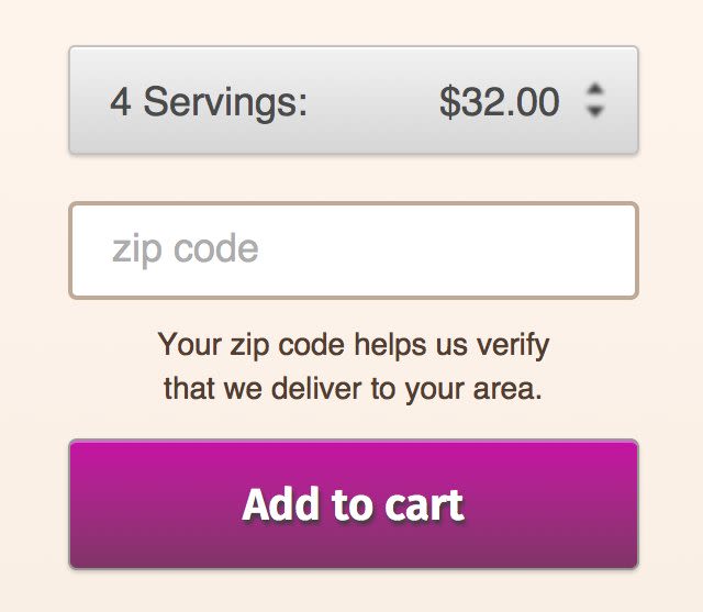
UX Challenge #3: Pricing
Fitly's pricing model was complex compared to our competitors, who offered simple pricing based on a flat cost per meal (2 servings for $15, for example). We had a tiered pricing model based on the number of servings purchased with a minimum order size of 8 servings. Recipes started at $7.99 per serving, but dropped to $6.99 at 12 servings and $5.99 at 20 servings. Unlike a typical e-commerce site, we couldn't simply display a price alongside each item because the price would change based on the number of servings in the user's shopping cart, potentially confusing them. We also couldn't embed the entire pricing story in every page because it was too lengthy.
I figured that clear and consistent messaging throughout the shopping path was the best way to tell the pricing story, so I incorporated a pricing story CTA in a standout color and placed it on pages that contained product information. Clicking on the CTA would display the larger pricing story within the context of the current page. I also turned the tiered pricing into an upsell strategy within the shopping cart by including messaging that told the user how much they could save if they added more servings to their cart.


Designing the Fitly experience proved to be an interesting challenge not just because of our lofty goals and tight timeline, but because it had some quirks that set it apart from the typical e-commerce formula. Check out the work samples below for additional design comps.